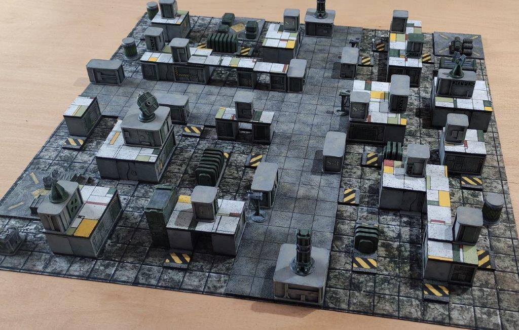
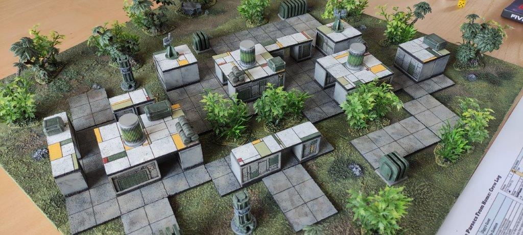
Following on from all the grey in the last post, the next step was to upgrade the cork tile pieces to provide a bit more visual interest. It occurred to me that I could do something different on the reverse side of each piece and, after discarding various colours and patterns, I decided on a muted pallet and some random blocks and lines (while still maintaining the 1″ grid that helps with alignment and movement, etc). Apparently it’s a sort of unintended Mondrian style knock-off.
The colours are pretty much those used in my terrain boards, so although they don’t bring a lot of extra brightness to the grey, they do tone in well with the majority of my stuff. I just used a fine marker pen and painted some of the sections.
First test pieces:


Some pics below of this scenery being used for a few Five Parsecs campaign battles. Using a mix of both the grey and coloured tile sides offers lots of variety. I don’t pretend that the settings make sense from an urban or industrial perspective, they’re really just 3D obstacle courses to fight over.


More scratchbuilding in the next post.


The colour looks really good. Just enough to add interest and not go all technicolor!
I think I’ve got one of those mats somewhere too…
Thanks Andy. Yes these mats are great value.
The colour looks great, mixes it up nicely and is also useable for other games, which is always good! So much inspiration that it’s difficult to concentrate on my own planned aesthetic though. I think will be going for either desert world or abandoned 21st century ruins plus space station/starship corridors that are a must have 🙂
Thanks Paul, both sounds excellent and are the type of thing you could keep coming back to and adding to over time.
I’m probably being a bit of a stick in the mud, but I much prefer the added colour version……..and laying out terrain on the wonk relative to the board edge is gentler on the eye. Now, if you could just round off the corners on those little squares…….
It’s all in the eye of the beholder mate! 🙂